…making contact with paper
Archive for the ‘ concept art ’ Category
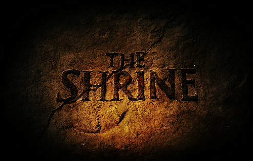
The Shrine Logo Development
Well I worked on the logo for the movie too. take a look at the process from start to finish. it was a pretty crazy battle!
After showing these concept, the direction wasn’t favored because they didn’t look “real” enough. We wanted something that looked like it was carved by hand on the Shrine itself! and National Geographic or someone took a picture of it. So I explored alot with hand made fonts that were inspired by Greek and Roman hand chiseled tablets. Here are some of the results!
The above concept we had the idea of the logo being carved into the wall of a cave and a torch was being used to light it. This was canned because the color palette was too warm and not dark and scary enough.
Played with mist/fog a common element in the film but it didn’t work too well. The next one is the final where the title is surrounded by latin text as if it was decoded for its meaning. The latin text plays a part in the film as the village where “The Shrine” speaks latin. The crack was placed to give it an ancient look and gives the feeling that something is going to go wrong. And we were excited by the cold color palette that looked like it was lit a night.
Well thats it guys. I know its not true sketching, but I did alot of thumbnails to get to these concepts. I’ll be back now with some regular good old fashioned sketching!
Side or Profile View
I have to admit that Tomasz Migurski really reinforced this idea when he saw my sketeches. Sometimes it is better to start from a side or front view of a drawing. It makes it easier on the brain and allows us to think about and break down the components of a design. Once we are comfortable with the design we can tackle it in perspective using the side and front views. Also try drawing with a really dark pen to boost your confidence in committing to your lines. This sketch was done with a fine pilot pen and Sharpies.
Flickr Photos
Our Favorites...
- Audrey Kawasaki
- CG Channel
- Chad Harber
- Concept Art
- ConceptDesignNews
- Core 77
- Coroflot: Design Portfolios
- Daniel Simon
- David Fleming
- Design Sketching
- designBoom
- Dominic Peralta
- Drawingboard
- Faris Elmasu
- Fengzshudesign
- ffffound
- gnomon workshop
- Harald Belker
- ID Sketching
- Joey Peralta
- Jon Corpuz
- Keep Drafting
- Machines & Humans
- Mark Behm
- Mark Colton
- Massive Black
- MICHAEL DiTULLO
- Mike Mattesi
- Notcot
- Paula Chang
- productdesignforums
- Ralph Mcquarrie
- Ryan Chruch
- Scott Roberston
- ShrunkenHeadMan
- SIMKOM
- Sparth’s Co:lab
- Syd Mead
- thejsun
- ToyFon
- Upwell Design


![3628692459_fb755191a7[1] 3628692459_fb755191a7[1]](https://live.staticflickr.com/2581/3682050553_72c5080af1_s.jpg)
![3628695853_a1e6a40195[1] 3628695853_a1e6a40195[1]](https://live.staticflickr.com/3568/3682863860_b7c69e3aea_s.jpg)
![3629536468_4c1c67e0c2[1] 3629536468_4c1c67e0c2[1]](https://live.staticflickr.com/2470/3682050349_88c7a10598_s.jpg)