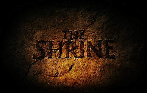
The Shrine Logo Development
Well I worked on the logo for the movie too. take a look at the process from start to finish. it was a pretty crazy battle!
After showing these concept, the direction wasn’t favored because they didn’t look “real” enough. We wanted something that looked like it was carved by hand on the Shrine itself! and National Geographic or someone took a picture of it. So I explored alot with hand made fonts that were inspired by Greek and Roman hand chiseled tablets. Here are some of the results!
The above concept we had the idea of the logo being carved into the wall of a cave and a torch was being used to light it. This was canned because the color palette was too warm and not dark and scary enough.
Played with mist/fog a common element in the film but it didn’t work too well. The next one is the final where the title is surrounded by latin text as if it was decoded for its meaning. The latin text plays a part in the film as the village where “The Shrine” speaks latin. The crack was placed to give it an ancient look and gives the feeling that something is going to go wrong. And we were excited by the cold color palette that looked like it was lit a night.
Well thats it guys. I know its not true sketching, but I did alot of thumbnails to get to these concepts. I’ll be back now with some regular good old fashioned sketching!


![3628692459_fb755191a7[1] 3628692459_fb755191a7[1]](https://live.staticflickr.com/2581/3682050553_72c5080af1_s.jpg)
![3628695853_a1e6a40195[1] 3628695853_a1e6a40195[1]](https://live.staticflickr.com/3568/3682863860_b7c69e3aea_s.jpg)
![3629536468_4c1c67e0c2[1] 3629536468_4c1c67e0c2[1]](https://live.staticflickr.com/2470/3682050349_88c7a10598_s.jpg)
Again, thanks for showing us your process and how you guys chose the right logo and the why behind it…that is so crucial as to how you are trying to convey the same dark and scary tone and how the important the color palette is…these are the slight of hand details that make this so bad ass and effective! I’m so impressed! and dont trip that it’s not “true” sketching, because this is about “story sketching”, the sketching that actually matters! looking forward to more and “the Shrine”
Wow…I really like the final version, as well as Concept A. There’s something really interesting about the scrawled type on Concept 4, too. I definitely like the ones without a direct light on it, it feels like it’s waiting to be discovered, rather than that moment of discovery.
I’m looking forward to more posts of The Shrine, as well!
Dear friends,
I’m doing a school project, and I wonder if I can provide the psd files of these works … I would be very grateful.
Yours faithfully,
Goncalo Alves