Sketch!
Archive for the ‘ fantacy ’ Category
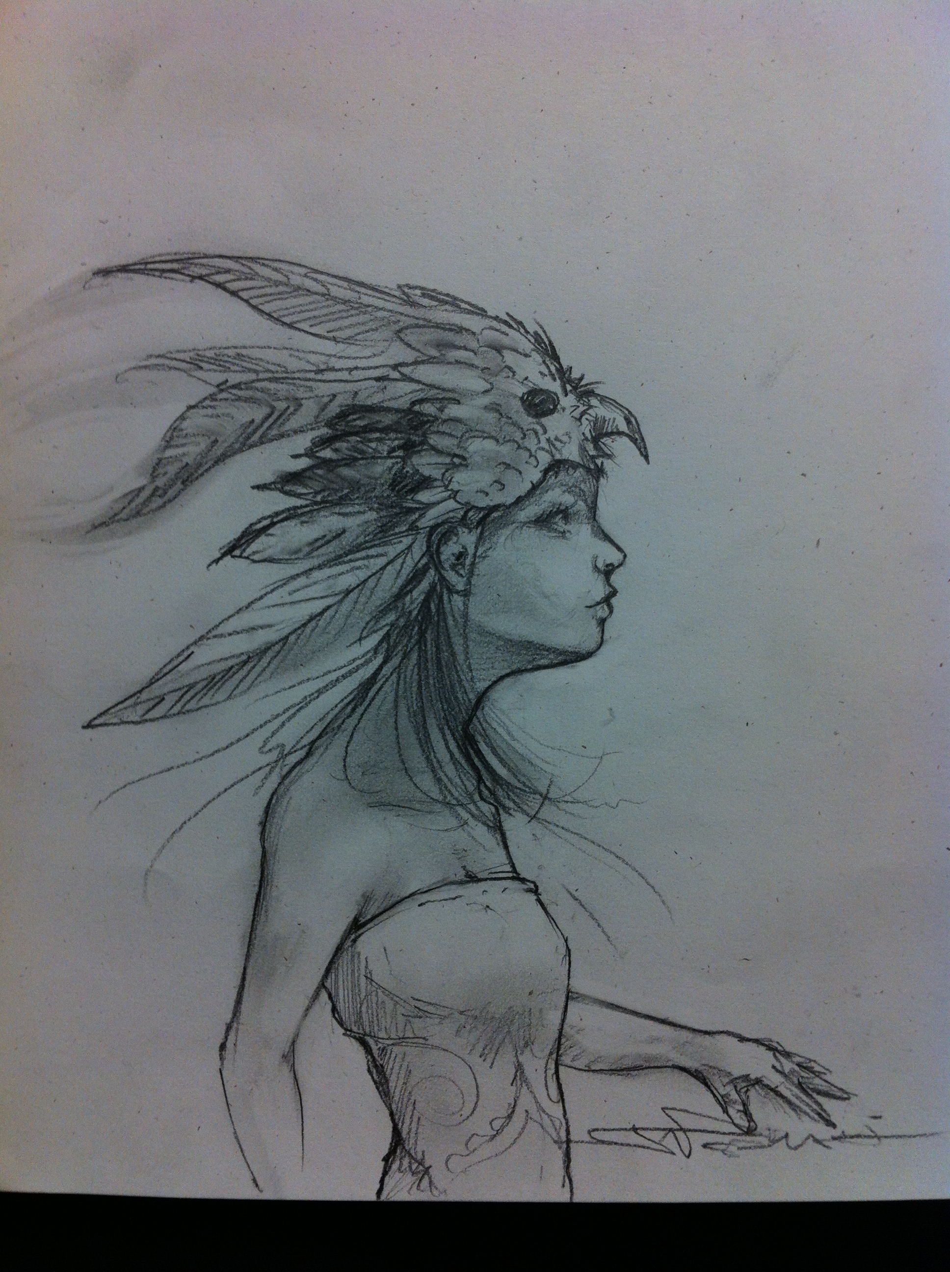
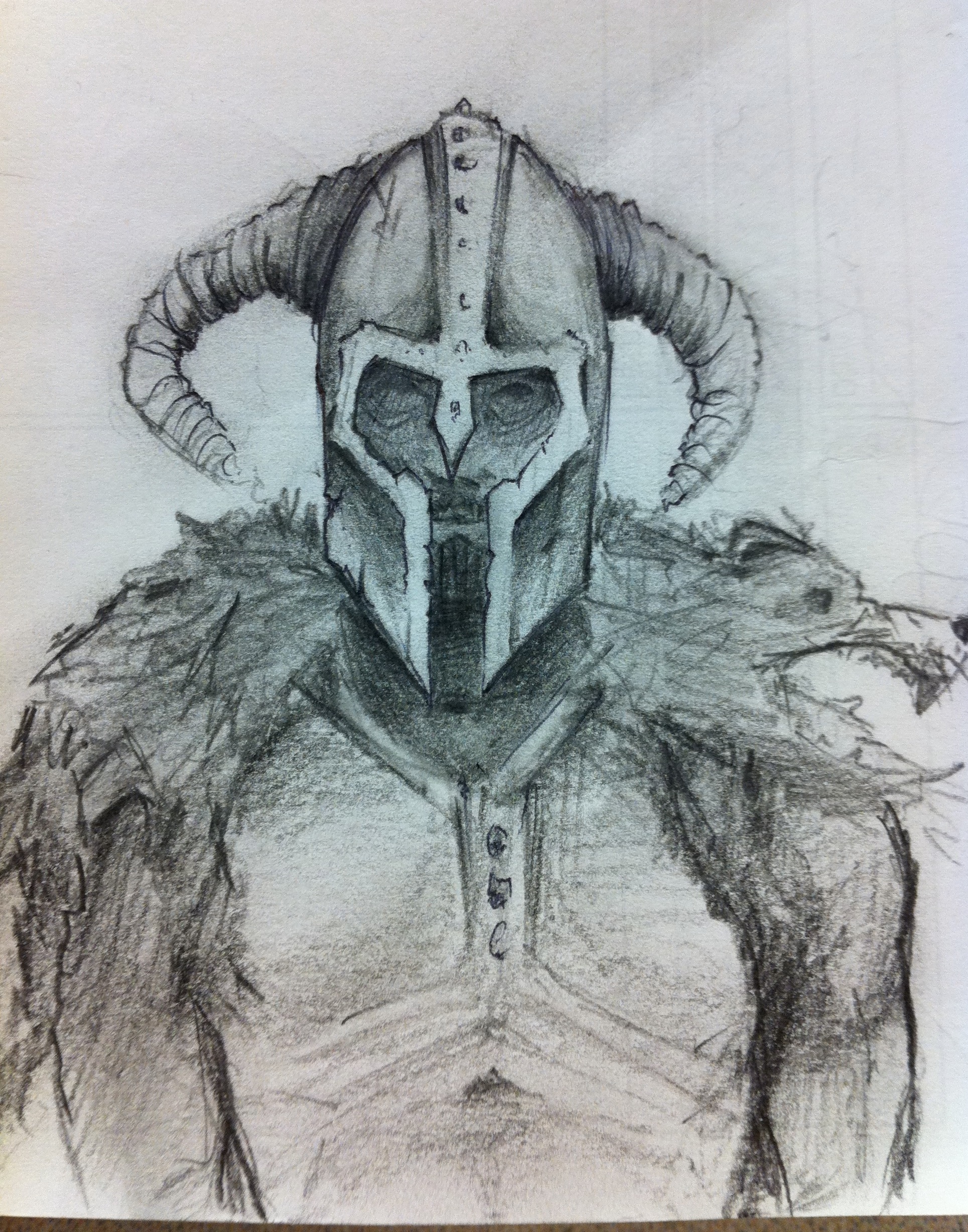
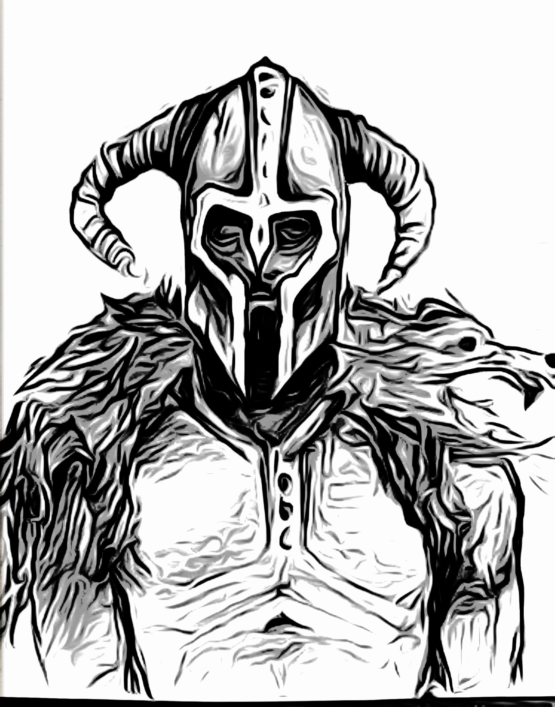
2 sketches from down time at work. Also I took the sketches and photographed them with my phone and used a photo editor to mess with them, leaving me with the last 2 black and white ones.
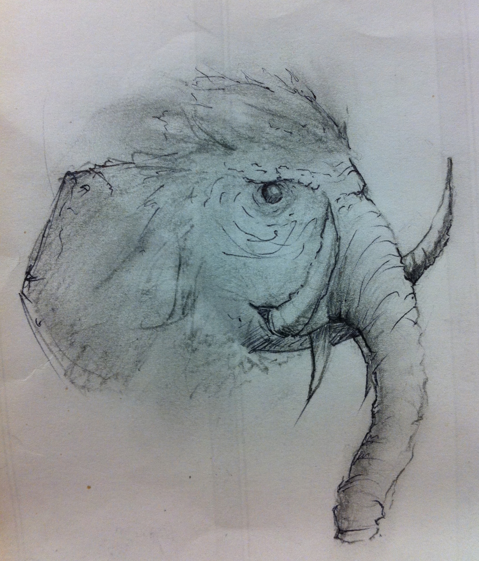

Random sketch while i was in class.


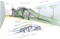
Hey guys, here are the final shots of the finished product. I call it hill, for obvious reasons..hehe. It’s is an interplay of floor, wall, and roof to break up our flat campus. My inspiration was the silicone valley hills that surround us. There is some more stuff on this on my site at fariselmasu.com
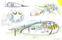
Here is some stuff from this semester. Urban design for SJSU. It was a fun project.

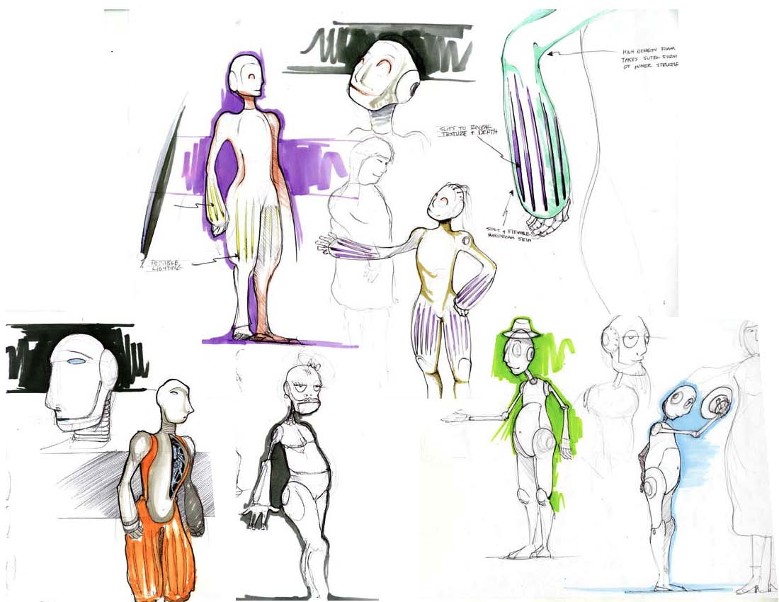
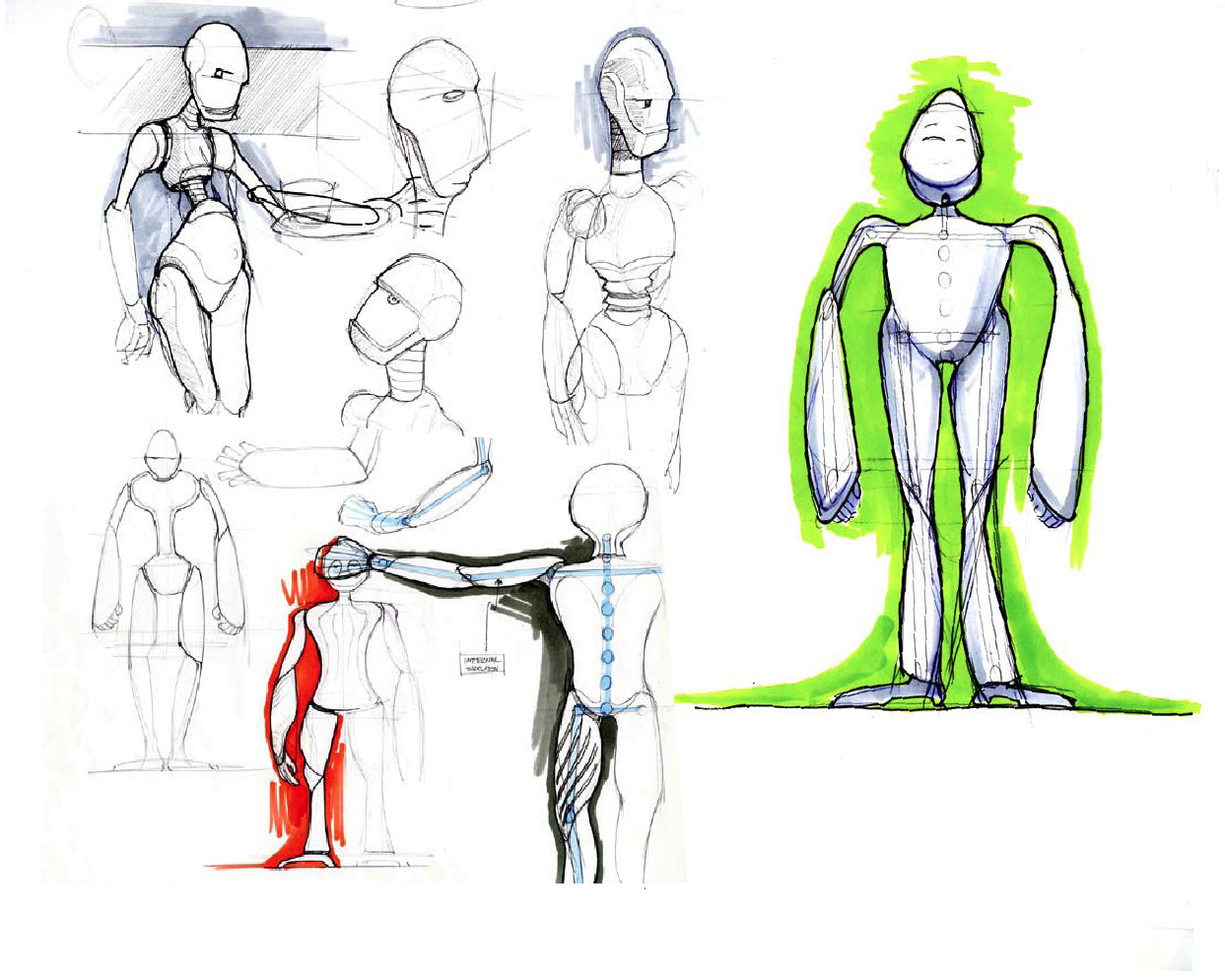
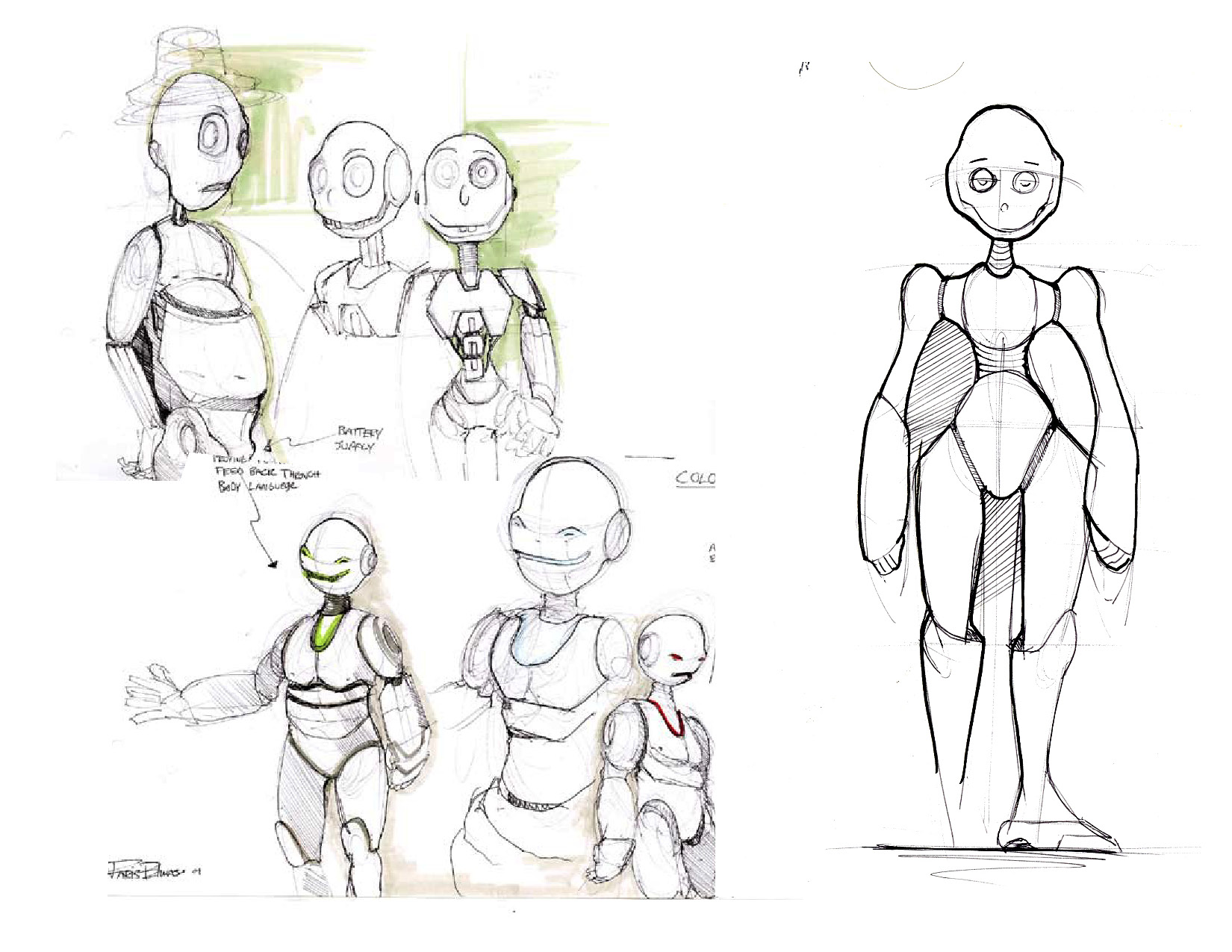
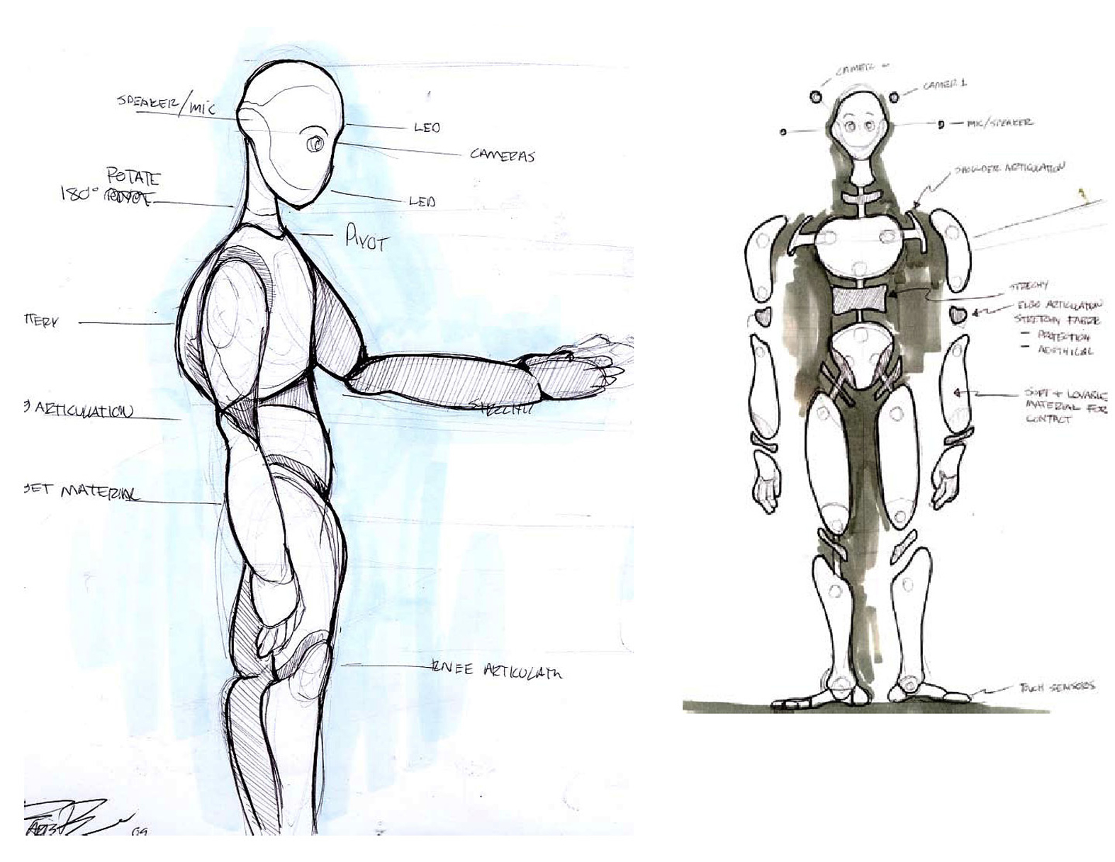
Hey guys! My first post on lineweights. Thanks Jon for getting me connected. Here are some robots that I drew for a project I did studing in Paris. I look forward in posting some more stuff. HAPPY NEW YEARS everyone!
Hey guys! Just thought i would post the label I made for me and my friends beer that we brewed!
It is pirate themed beer!

A quick thumb and refined thumb. I’m planing on taking it further.

Well I worked on the logo for the movie too. take a look at the process from start to finish. it was a pretty crazy battle!

Logo Concept A

Logo Concept B

Logo Concept C
After showing these concept, the direction wasn’t favored because they didn’t look “real” enough. We wanted something that looked like it was carved by hand on the Shrine itself! and National Geographic or someone took a picture of it. So I explored alot with hand made fonts that were inspired by Greek and Roman hand chiseled tablets. Here are some of the results!

Logo Concept 4

Logo Concept 5
The above concept we had the idea of the logo being carved into the wall of a cave and a torch was being used to light it. This was canned because the color palette was too warm and not dark and scary enough.

Logo Concept 6
Played with mist/fog a common element in the film but it didn’t work too well. The next one is the final where the title is surrounded by latin text as if it was decoded for its meaning. The latin text plays a part in the film as the village where “The Shrine” speaks latin. The crack was placed to give it an ancient look and gives the feeling that something is going to go wrong. And we were excited by the cold color palette that looked like it was lit a night.

Final Logo Concept
Well thats it guys. I know its not true sketching, but I did alot of thumbnails to get to these concepts. I’ll be back now with some regular good old fashioned sketching!
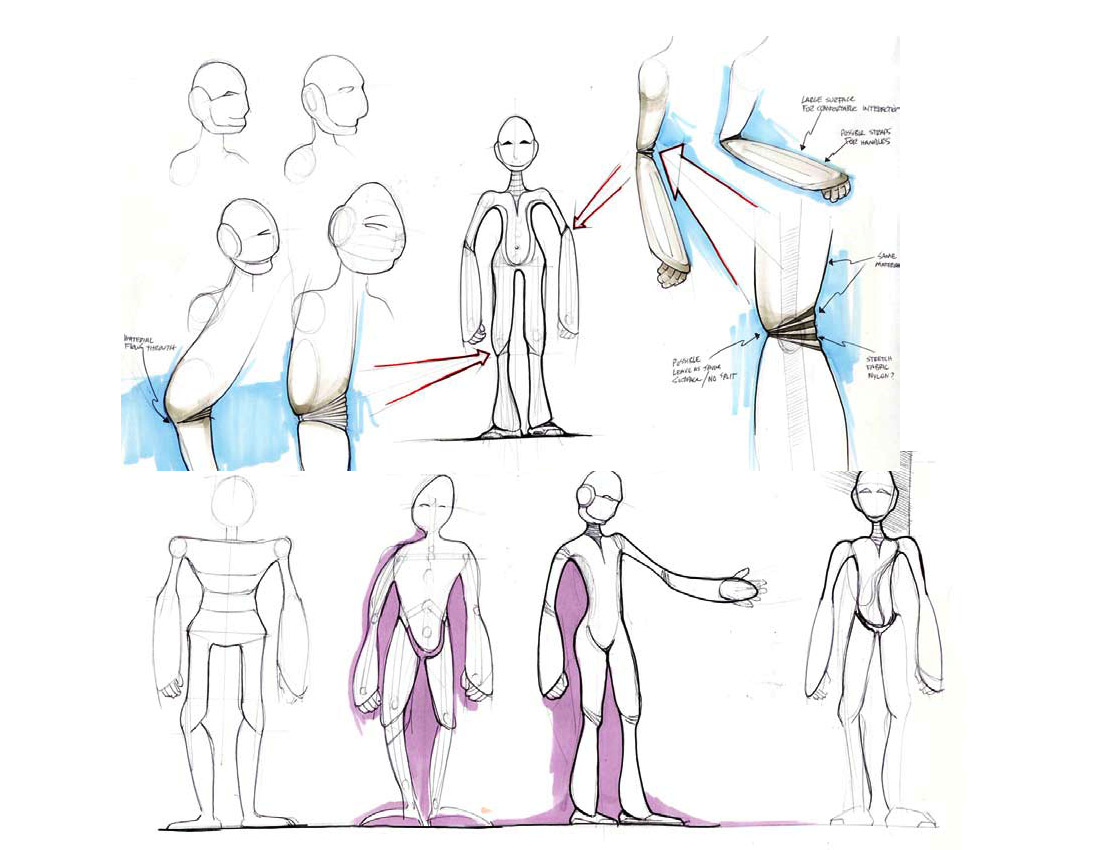
Hey-O! Sooo remember the Mr. Fancy sketch….. Well here he is as a 3D model!!!
He is only 8700 triangles, meant to be a game character.
This is just the base model that i am still working on. Textures and color will come soon!


This was my final for my Anatomy class. Basically we were required to combine a human with an animal.

![3628692459_fb755191a7[1]](https://live.staticflickr.com/2581/3682050553_72c5080af1_s.jpg "3628692459_fb755191a7[1]")
![3628695853_a1e6a40195[1]](https://live.staticflickr.com/3568/3682863860_b7c69e3aea_s.jpg "3628695853_a1e6a40195[1]")
![3629536468_4c1c67e0c2[1]](https://live.staticflickr.com/2470/3682050349_88c7a10598_s.jpg "3629536468_4c1c67e0c2[1]")
