Archive for the ‘ movies ’ Category

The Shrine Logo Development

Well I worked on the logo for the movie too. take a look at the process from start to finish. it was a pretty crazy battle!

Logo Concept A

Logo Concept A

Logo Concept B

Logo Concept B

Logo Concept C

Logo Concept C

After showing these concept, the direction wasn’t favored because they didn’t look “real” enough. We wanted something that looked like it was carved by hand on the Shrine itself! and National Geographic or someone took a picture of it. So I explored alot with hand made fonts that were inspired by Greek and Roman hand chiseled tablets. Here are some of the results!

Logo Concept 4

Logo Concept 4

Logo Concept 5

Logo Concept 5

The above concept we had the idea of the logo being carved into the wall of a cave and a torch was being used to light it. This was canned because the color palette was too warm and not dark and scary enough.

Logo Concept 6

Logo Concept 6

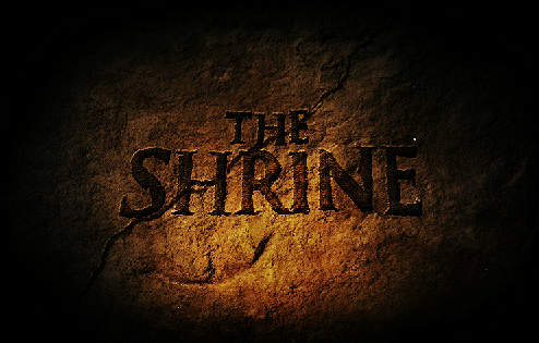
Played with mist/fog a common element in the film but it didn’t work too well. The next one is the final where the title is surrounded by latin text as if it was decoded for its meaning. The latin text plays a part in the film as the village where “The Shrine” speaks latin. The crack was placed to give it an ancient look and gives the feeling that something is going to go wrong. And we were excited by the cold color palette that looked like it was lit a night.

Final Logo Concept

Final Logo Concept

Well thats it guys. I know its not true sketching, but I did alot of thumbnails to get to these concepts. I’ll be back now with some regular good old fashioned sketching!

Advertisement

The Shrine Movie Artwork

Hey Guys,

Well I know I’ve been MIA for too long! So I thought I’d share what I’ve been so busy with during my sketch time! I’ve been helping my friends who are producing a feature film this summer. They asked me to work on a teaser poster for the movie and develop a logo. The movie is called “The Shrine” Here is the synopsis of the movie:

“After a young American backpacker goes missing in Europe, a group of journalists link his disappearance to a remote Polish village called Alvaina. Upon further investigation, the journalists discover that Alvaina has a history of bizarre cult activity revolving around human sacrifice. Hellbent on revealing the truth, they travel to the small village to uncover the story first hand. But after the discovery of an ancient stone statue hidden within the town, they quickly find themselves pursued by a mysterious and vengeful group of locals. Forced into the gruesome reality of true survival horror, the journalists soon realize that Alvaina hides a much darker secret than they could ever imagine.”

So I thought I’d share some of my process…

Quick Ideation Thumbnails

Quick Ideation Thumbnails

A few days in I sent them this “Comp” Artwork along with a bunch of reference images of old gargoyles and roman ruins etc. also reference images of fog as in the movie the statue is surrounded by fog. The idea was to be looking up at the statue like an observer that took a photograph of this thing. I wanted it to look like anyone could have come across this in the woods and taken a photograph. Realism was my inspiration.

Comp Artwork

Comp Artwork

This was composited with Photoshop. I had a picture of a maquette of the statue that I used to help with the poster. The next image is the result of a HUGE photoshop file where I composited pictures of trees, 3D renders of the statue and base and did alot of digital painting. It was alot of work but a lot of fun! There were many iterations to get to this but here is the final.

Final Poster

Final Poster

Thats the story of the poster. I’m going to do another post that goes through the logo design that actually proved to be more challenging than the poster itself! A movie title is a brand after all!

the hurt locker

great movie.  would recommend sitting farther back for this one if you get motion sickness.

fyi, i love drawing armoury-type stuff.  drew this iconic scene using a papermate pro fit pen on 98 HP printer paper.  added some photshop color to give the sketch more pop.

the hurt locker movie site

the_hurt_locker