Happy New Years from Lineweights!
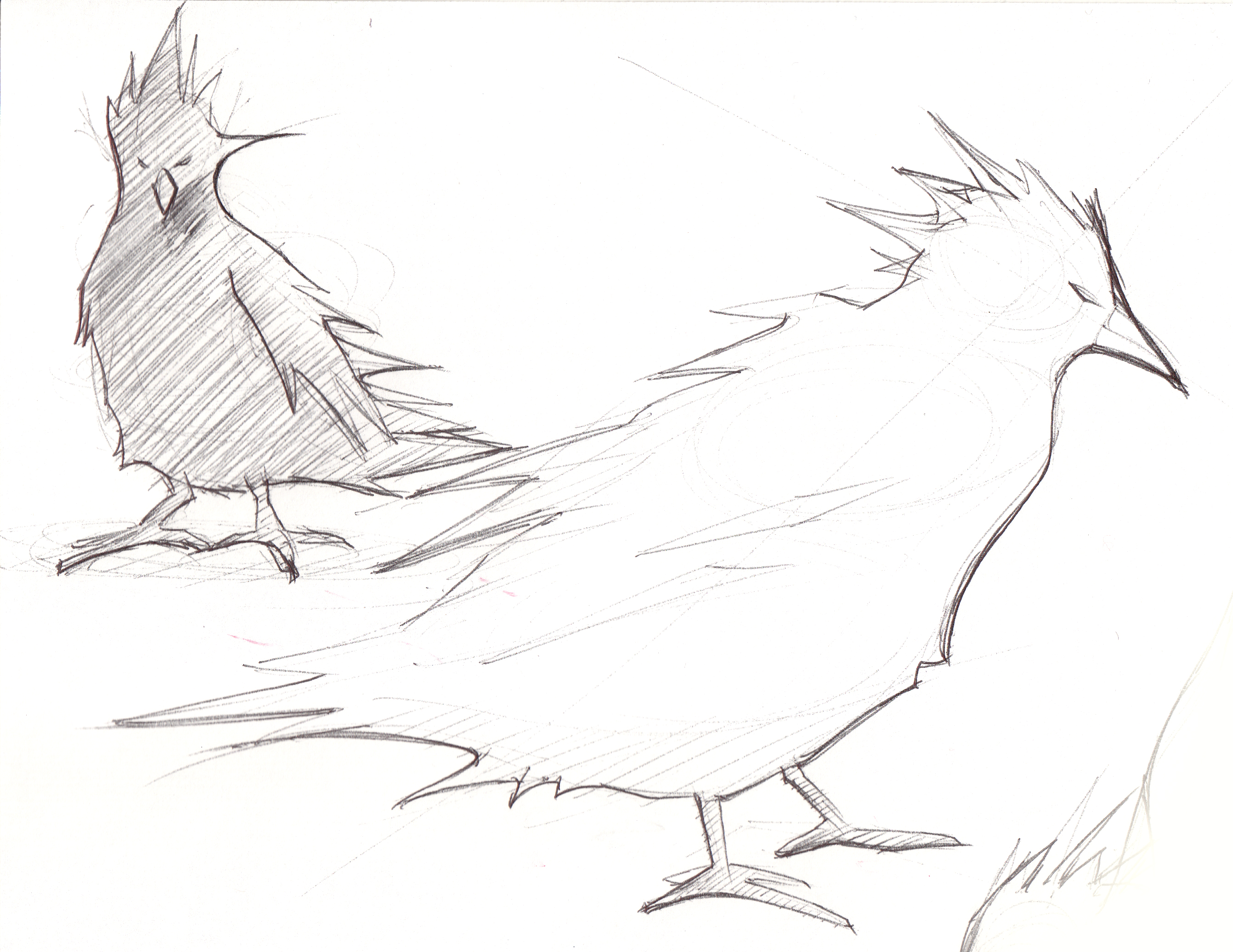
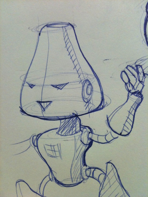
can’t ring in the new year without one more sketch blog! can you guess who i ripped this sketch off from? (i did sketch it myself)

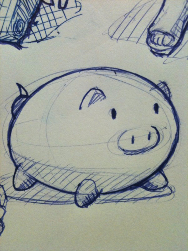
Here’s another for good measure.

Author Archive
can’t ring in the new year without one more sketch blog! can you guess who i ripped this sketch off from? (i did sketch it myself)
Here’s another for good measure.
yes, the real world can be very demanding of people’s time and alas am left with only the time it takes to boot my laptop at work to indulge in my pen-to-paper craft.

hey folks, it’s been awhile so here’s a sketch and rendering of an alien in homage to the new aliens vs. predator game coming out today. i looked at a bunch of alien images and made up my own composition.
i decided to encompass what i would do with markers in photoshop. it’s a very quick and basic render and all you really need to know is how to use the paint brush, eraser, selection tools, and layers. this took a little over an hour.
 scanned in my sketch. copied the background layer and made it its own and set it to “multiply” so that the color layers in the next images can go underneath it with the lines still there. kind of like a render sandwich.
 set in ONE color under-layer (below the multiplied sketch layer). used the selection tool to select the areas i want to color first. hopefully your lineweight is strong enough so selecting won’t be a pain.
 created another layer and added a medium (darker) color to add contrast. here’s a neat trick i learned at work. go to the first color layer, by using the rectangular selection tool select the area of what you want to select, then set it to the “Move” tool then press left and then right on your arrow keys. magically, your color layer is selected to the utmost accuracy. pretty neat right?

and finally adding a final layer with dark tones to give it even more contrast. i have 3 color layers by now and i just messed with the opacity on each layer to get the contrast i want overall.
enjoy! – alessandro
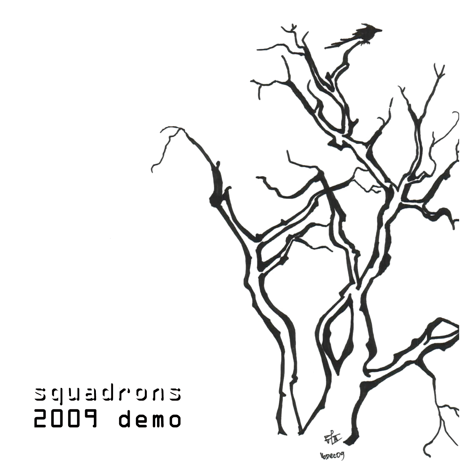
the winning artwork that is featured on our 2009 demo:

and some additional art from others voluntarily contributing:

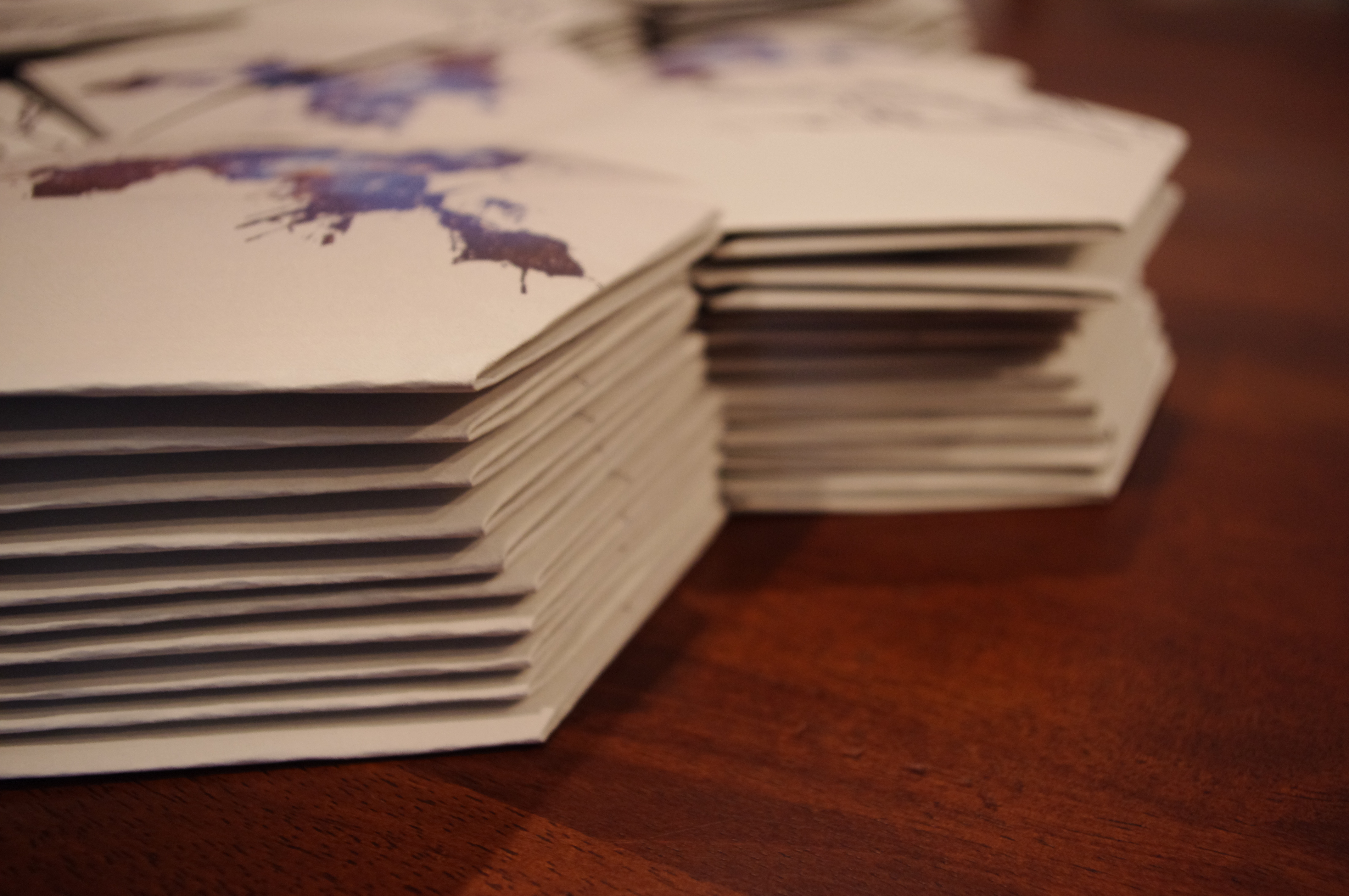
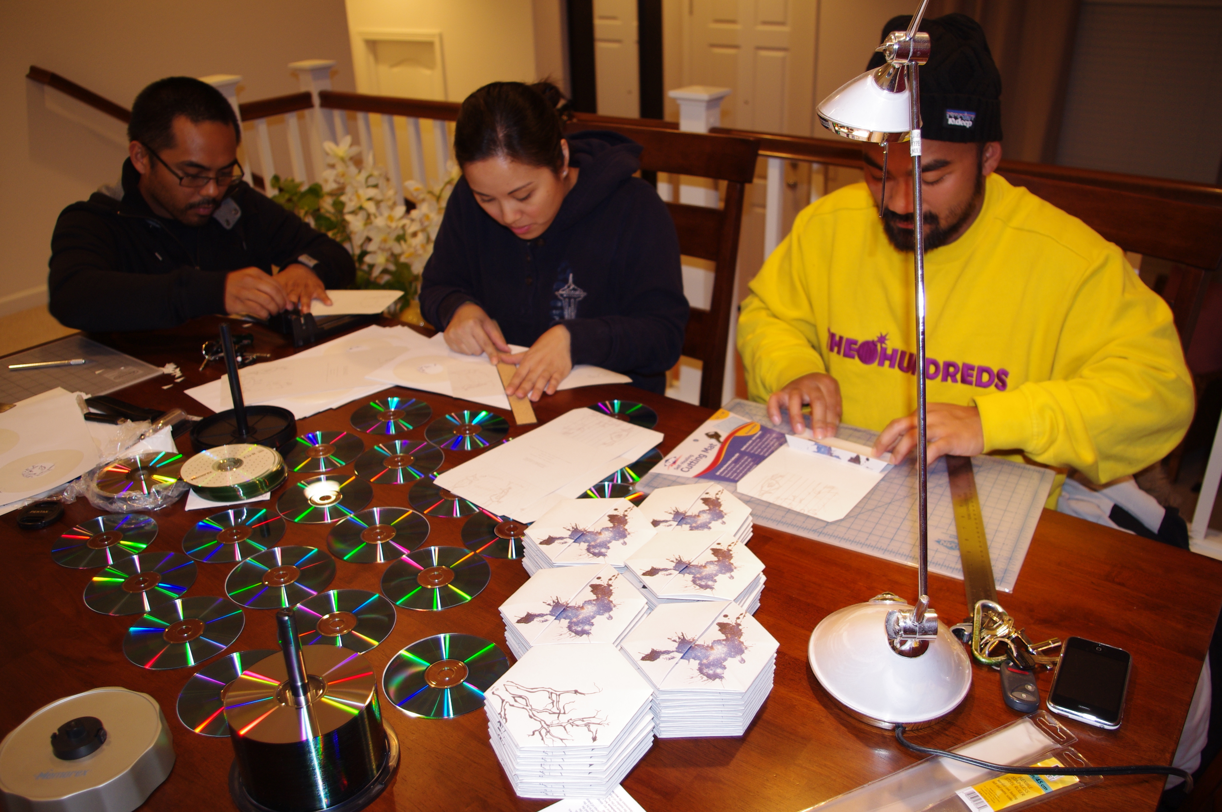
thanks to all that participated!
if you would like a copy of our demo, please visit our webstore:

UPDATED – We will be choosing a winner between december 11th-14th
just thought i’d do something a little fun and have a little contest for my little band.
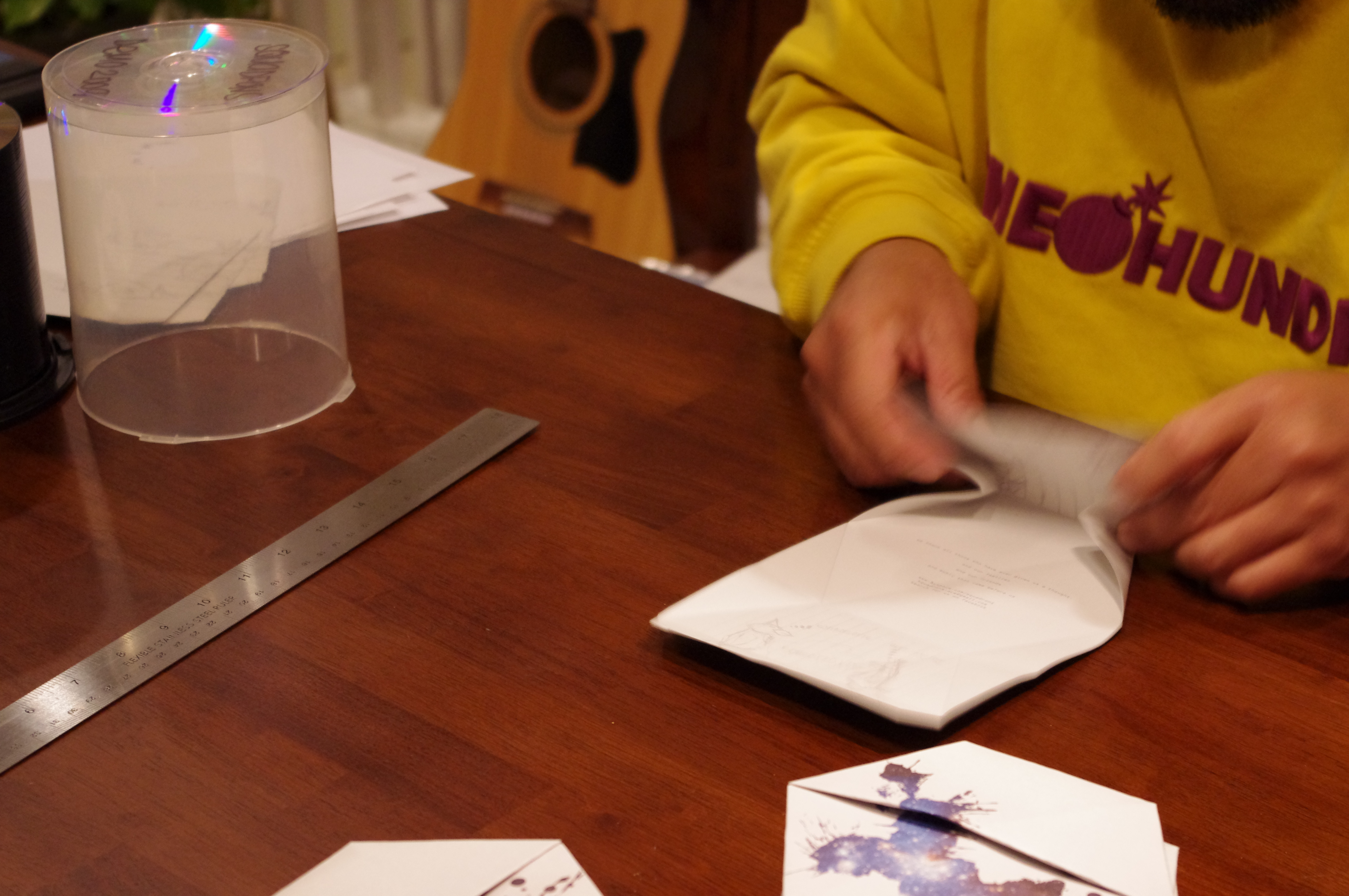
my group squadrons will be releasing a 4-track demo and we would like to support anyone interested in showing off their art. we encourage you guys to submit any form of art you would like to have featured on our cd sleeve and/or t-shirts for this demo release. the winner will get a nifty prize (approx. $50 in value), along with a copy of our demo and a shirt (and maybe featured in a music video we are planning to film).
keep in mind that your art will be fitted on a 5×5 medium. it may help to listen to the music while you create! sketch what you hear! that’s an interesting exercise!
please title your emails “CONTEST” and send to: squadrons.ace@gmail.com
or if you have questions feel free to comment on this post or email the band.
our logo was inspired by some wall art found at SJSU’s art building. you don’t have to use our logo, in fact we would prefer something different.
my favorite band in the world, the kidcrash, have posted a new track for their upcoming album “snacks“. their artwork for their past album covers intrigue me. i sketched this while listening to their track “wound eraser” and trying to encompass their past album art by just sketching rand-o stuff. but as you can see it will never have that “artsy” feel to it. D:

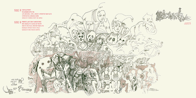
kidcrash – “jokes” lp cover art
kidcrash – demo 2006

great movie. would recommend sitting farther back for this one if you get motion sickness.
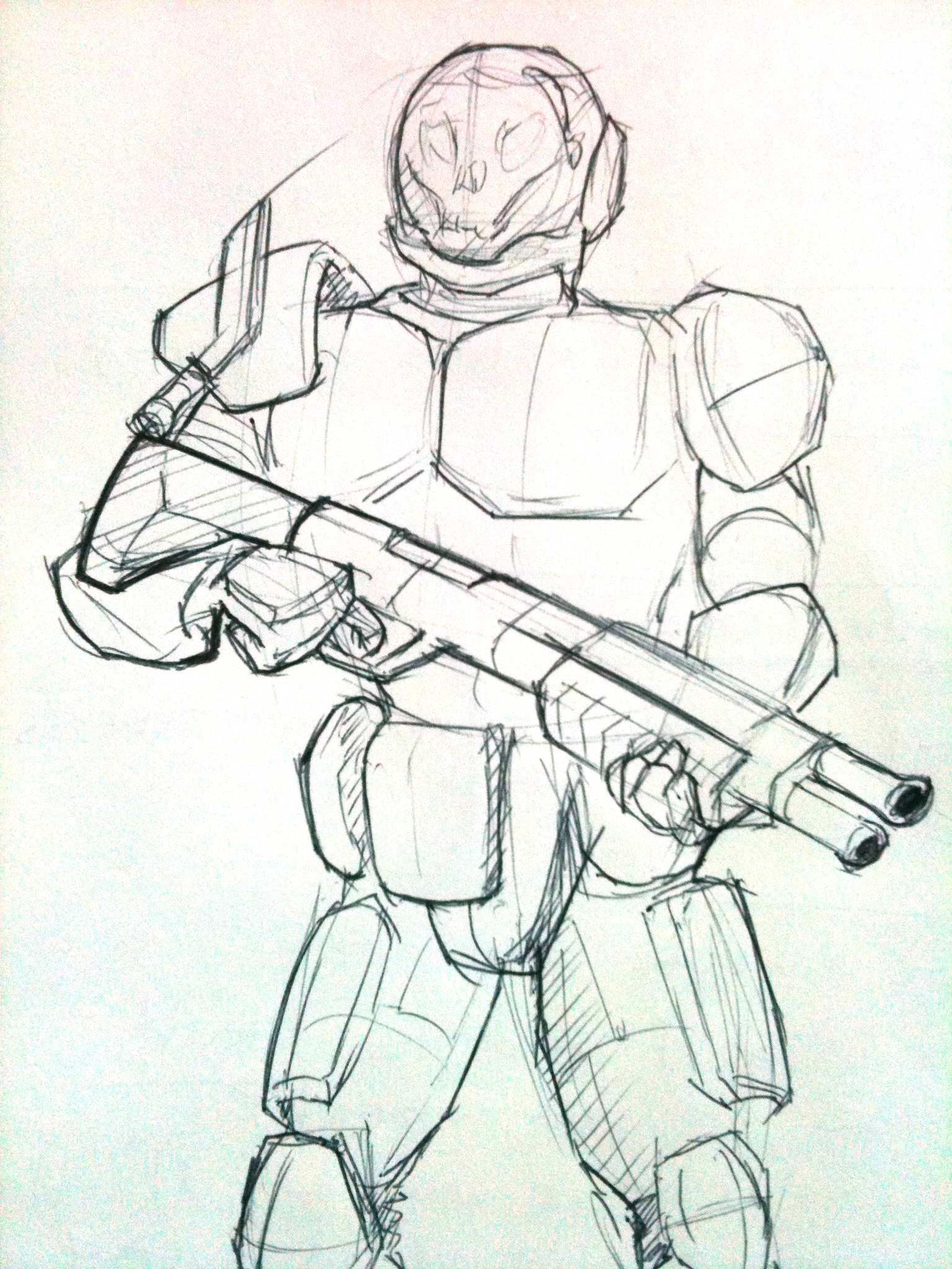
fyi, i love drawing armoury-type stuff. drew this iconic scene using a papermate pro fit pen on 98 HP printer paper. added some photshop color to give the sketch more pop.

this is a shotgun blast of some ideation sketches i did for the fore-mentioned creature project jon has showcased. i came up with a creature that you wore on your neck that would eat second-hand smoke in your environment. this was a great warm up project that lasted about two weeks.

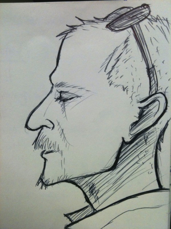
referencing from a photo, i was trying to do mainly hatching in one direction to somehow shape the form of her head – especially in her hair.
trying out the red pen thing. all my pens suck. i was working on this and the ink kept leaving wet spots so i would start blotching all over this. i now have dried red ink on the underside of my hand opposite of my thumb. had to cut it short.
looking like a good thing that i stopped! didn’t want to over-work this.

here’s a sketch out of a storyboard i’m brainstorming for the rumored ROBOTECH live-action movie that is supposedly in the works.
i was hoping to create a diy trailer teaser in celebration of the movie coming out. how i’m going to do that, i guess we’ll wait and see, right kingsley?

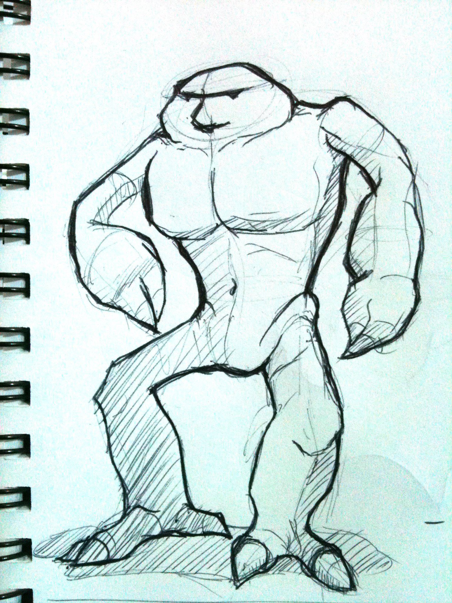
i was looking at some artwork for a video game called “Magna Carta II” and i was really inspired to draw some weapons and muscles. i started thinking up a story for this fellow as i was drawing too.

probably my favorite franchise of the 80s, i finally got this toy since the time 20 years ago of begging and crying to my mother to get one for me. it was expesnive back then (still is now) and, needless to say, my mother never gave in which probably led to my obsession.
i used an indigo prismacolor pencil, black ball-point pen, sharpie, and added the splash red using photoshop.


![3628692459_fb755191a7[1]](https://live.staticflickr.com/2581/3682050553_72c5080af1_s.jpg "3628692459_fb755191a7[1]")
![3628695853_a1e6a40195[1]](https://live.staticflickr.com/3568/3682863860_b7c69e3aea_s.jpg "3628695853_a1e6a40195[1]")
![3629536468_4c1c67e0c2[1]](https://live.staticflickr.com/2470/3682050349_88c7a10598_s.jpg "3629536468_4c1c67e0c2[1]")
