Sketch!
Archive for the ‘ character sketching ’ Category
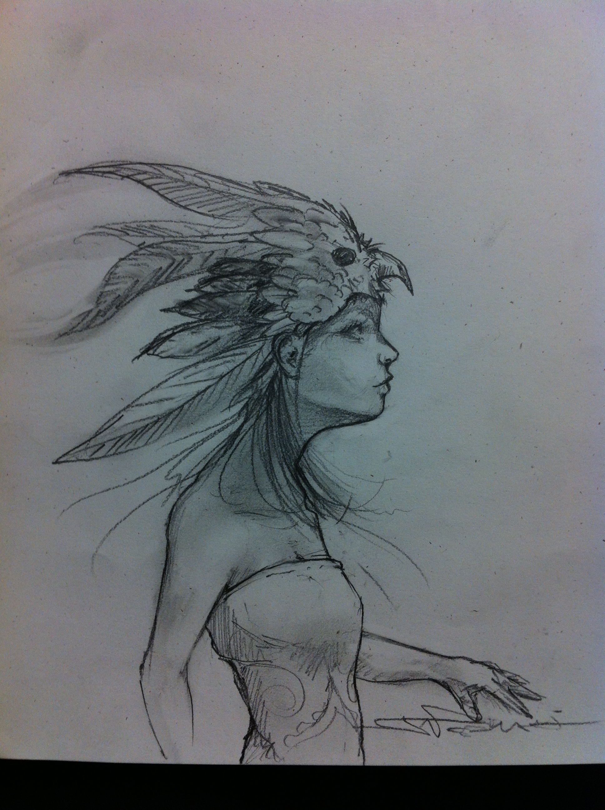
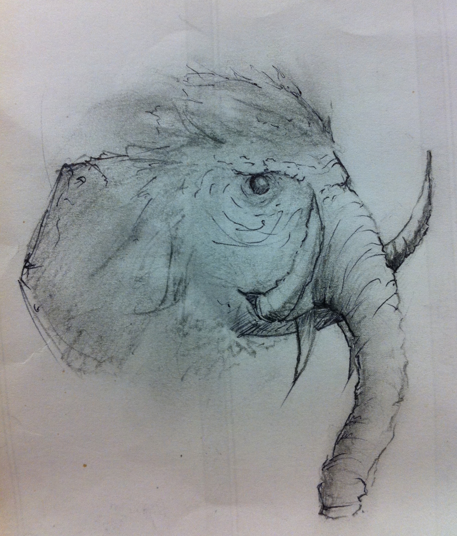
2 sketches from down time at work. Also I took the sketches and photographed them with my phone and used a photo editor to mess with them, leaving me with the last 2 black and white ones.

THM stands for Top Hat Man.
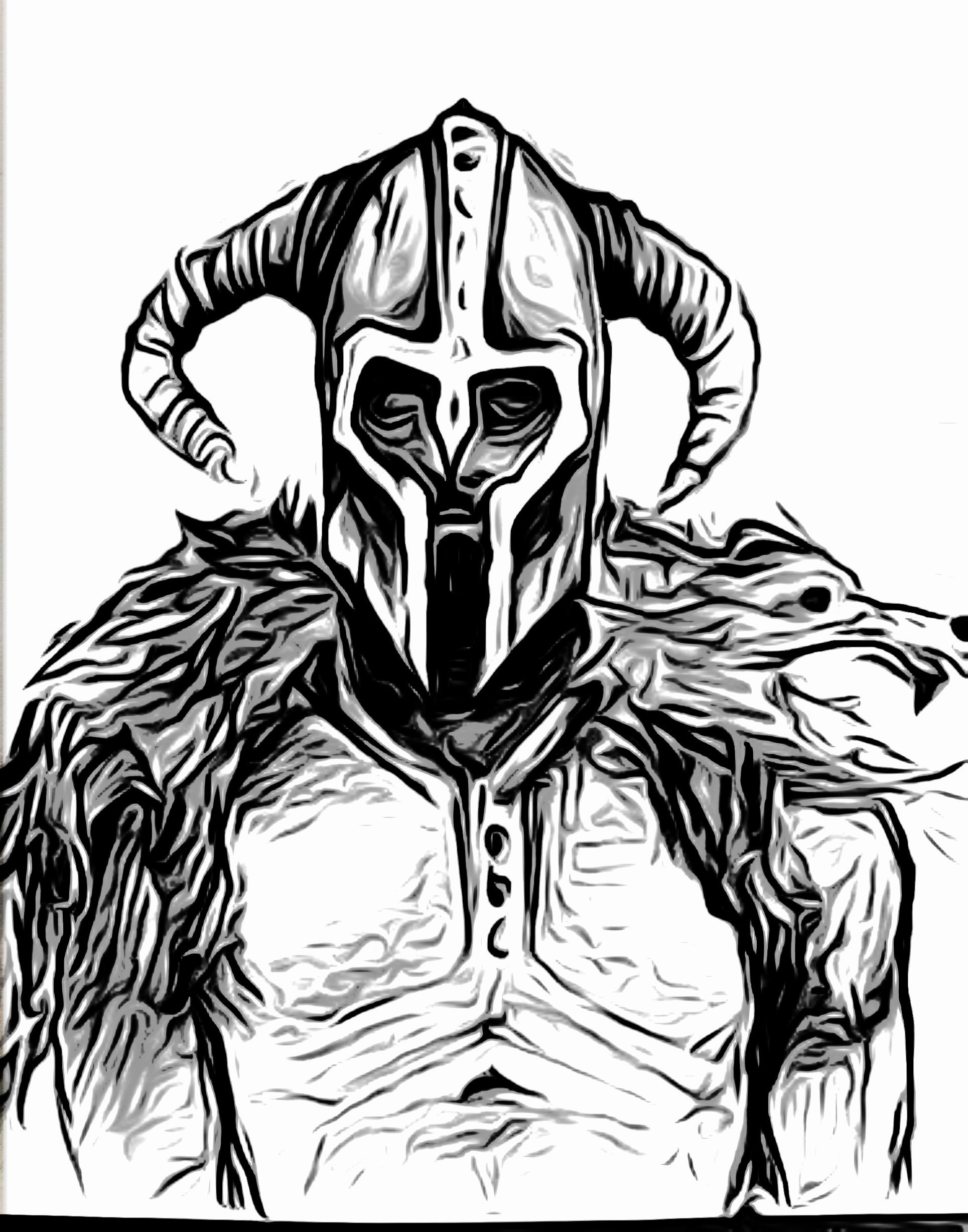
Anyway, Just did a quick render over the original sketch. I might go back and finish him up or see what else i can do with him.

Number 2 pencil and a fine tip sharpie.

hey folks, it’s been awhile so here’s a sketch and rendering of an alien in homage to the new aliens vs. predator game coming out today. i looked at a bunch of alien images and made up my own composition.
i decided to encompass what i would do with markers in photoshop. it’s a very quick and basic render and all you really need to know is how to use the paint brush, eraser, selection tools, and layers. this took a little over an hour.
 scanned in my sketch. copied the background layer and made it its own and set it to “multiply” so that the color layers in the next images can go underneath it with the lines still there. kind of like a render sandwich.
 set in ONE color under-layer (below the multiplied sketch layer). used the selection tool to select the areas i want to color first. hopefully your lineweight is strong enough so selecting won’t be a pain.
 created another layer and added a medium (darker) color to add contrast. here’s a neat trick i learned at work. go to the first color layer, by using the rectangular selection tool select the area of what you want to select, then set it to the “Move” tool then press left and then right on your arrow keys. magically, your color layer is selected to the utmost accuracy. pretty neat right?

and finally adding a final layer with dark tones to give it even more contrast. i have 3 color layers by now and i just messed with the opacity on each layer to get the contrast i want overall.
enjoy! – alessandro
Random sketch while i was in class.

Hey Guys,
I’ve been super inspired by Spencer Nugent’s Sketch-A-Day and I’ve taken it upon myself to do the same thing! So here is the first one I copied some stuff from Burne Hogarths Book “Dynamic Figure Drawing” Used a pilot razor point 2 on trace.

Razor Point 2, Trace
A quick thumb and refined thumb. I’m planing on taking it further.

I could say I’ve been busy which is partly true after getting a second job but, for the most part I have been lazy. And, looking at the time I could be spending on doing more creative things, I end up chosing something unproductive and unrewarding. Then I go into a cycle of regret and loathing that I question myself if I even have the passion to create anymore or if I was just looking for that steady job to pay my filthy habits. There are many books that have been read partially or have been unread, many drawings and sketchings that haven’t been finished, and many ideas that haven’t seen the light of day on paper. Perhaps all creative people go through this cycle of aspiration and laziness.


great movie. would recommend sitting farther back for this one if you get motion sickness.
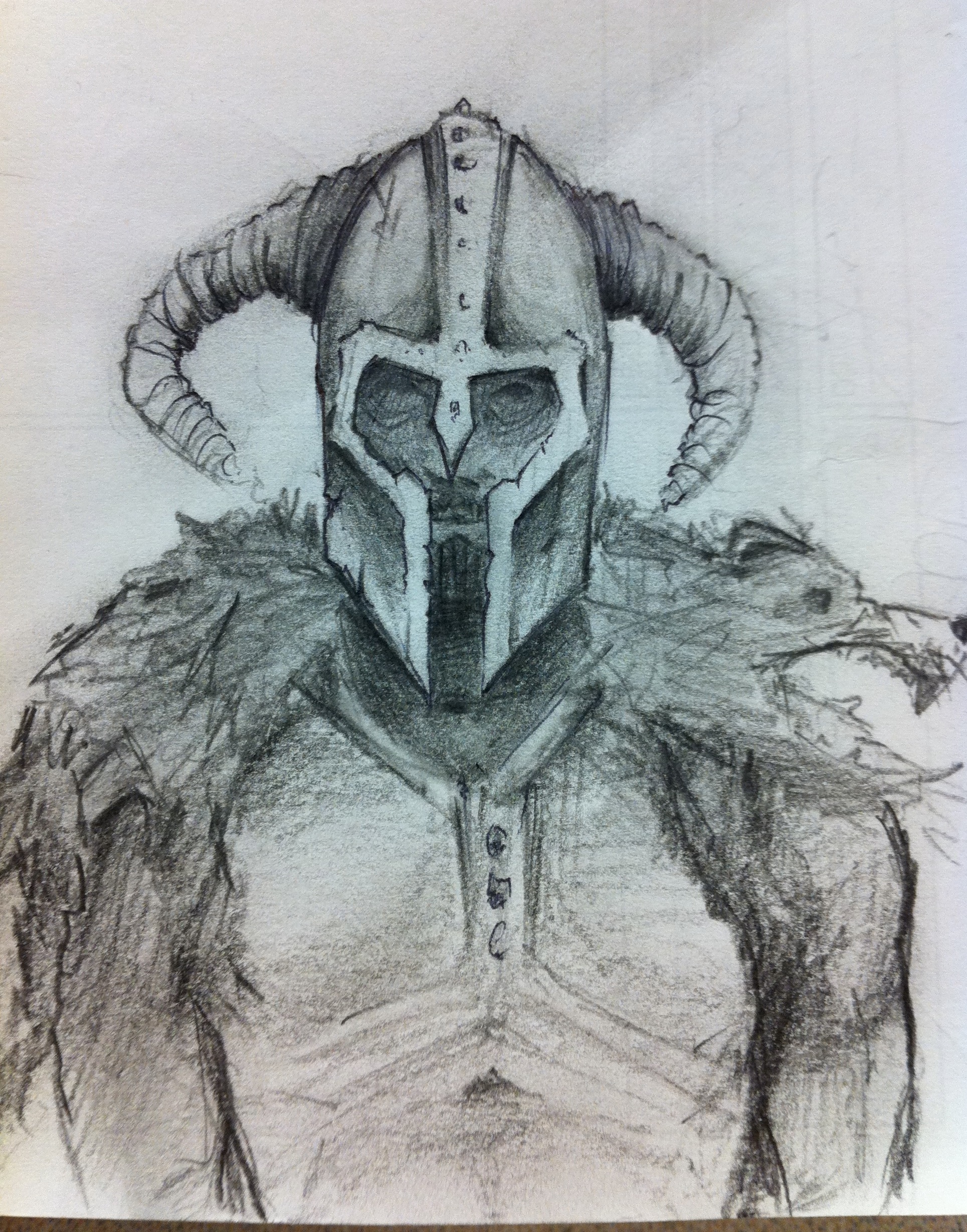
fyi, i love drawing armoury-type stuff. drew this iconic scene using a papermate pro fit pen on 98 HP printer paper. added some photshop color to give the sketch more pop.

I have to admit that Tomasz Migurski really reinforced this idea when he saw my sketeches. Sometimes it is better to start from a side or front view of a drawing. It makes it easier on the brain and allows us to think about and break down the components of a design. Once we are comfortable with the design we can tackle it in perspective using the side and front views. Also try drawing with a really dark pen to boost your confidence in committing to your lines. This sketch was done with a fine pilot pen and Sharpies.


![3628692459_fb755191a7[1]](https://live.staticflickr.com/2581/3682050553_72c5080af1_s.jpg "3628692459_fb755191a7[1]")
![3628695853_a1e6a40195[1]](https://live.staticflickr.com/3568/3682863860_b7c69e3aea_s.jpg "3628695853_a1e6a40195[1]")
![3629536468_4c1c67e0c2[1]](https://live.staticflickr.com/2470/3682050349_88c7a10598_s.jpg "3629536468_4c1c67e0c2[1]")
