Archive for the ‘ Experiment ’ Category

cd cover art CONTEST?! UPDATED

UPDATED – We will be choosing a winner between december 11th-14th

just thought i’d do something a little fun and have a little contest for my little band.

my group squadrons will be releasing a 4-track demo and we would like to support anyone interested in showing off their art.  we encourage you guys to submit any form of art you would like to have featured on our cd sleeve and/or t-shirts for this demo release.  the winner will get a nifty prize (approx. $50 in value), along with a copy of our demo and a shirt (and maybe featured in a music video we are planning to film).

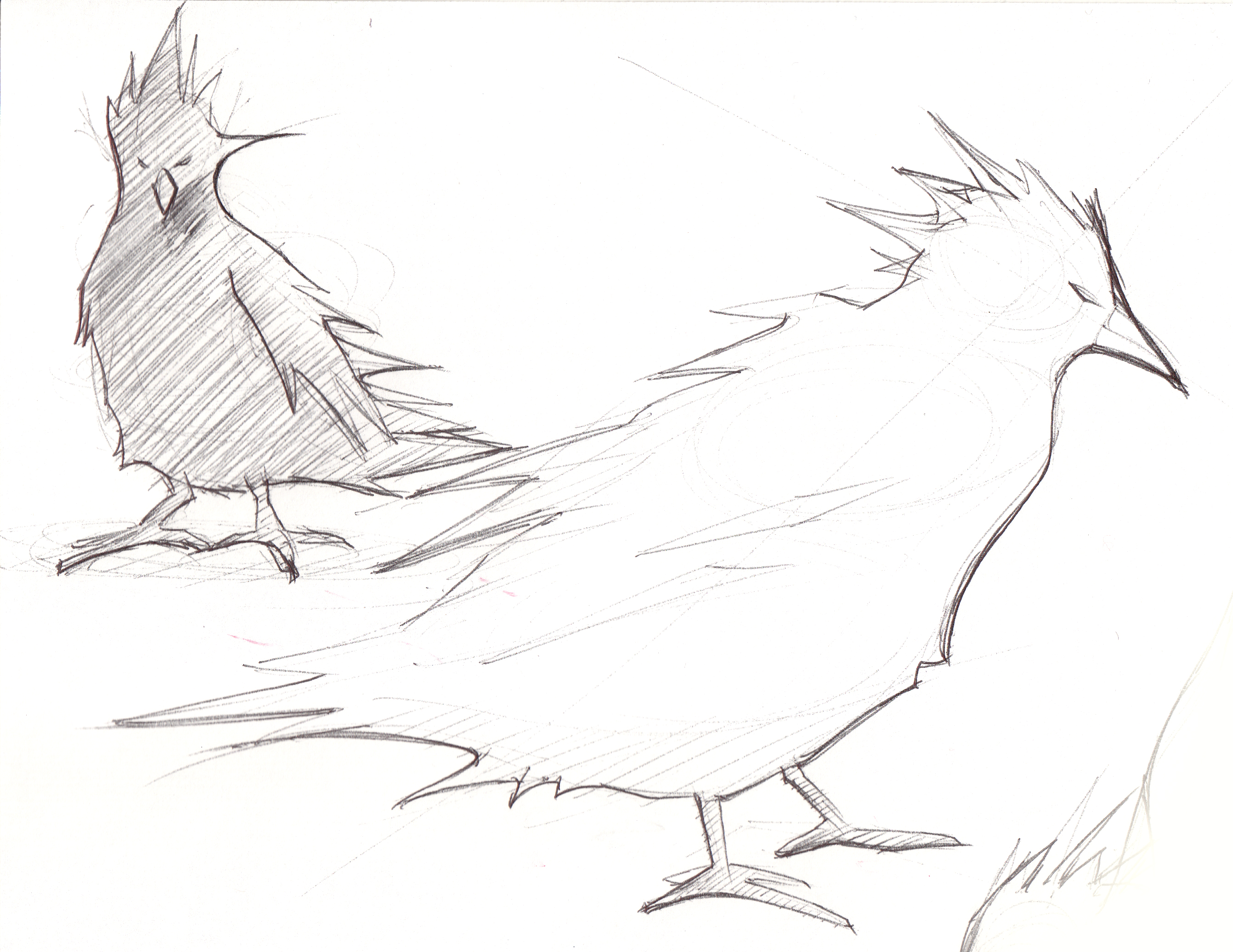
keep in mind that your art will be fitted on a 5×5 medium.  it may help to listen to the music while you create!  sketch what you hear!  that’s an interesting exercise!

squadrons on myspace

squadrons on facebook

please title your emails “CONTEST” and send to: squadrons.ace@gmail.com

or if you have questions feel free to comment on this post or email the band.

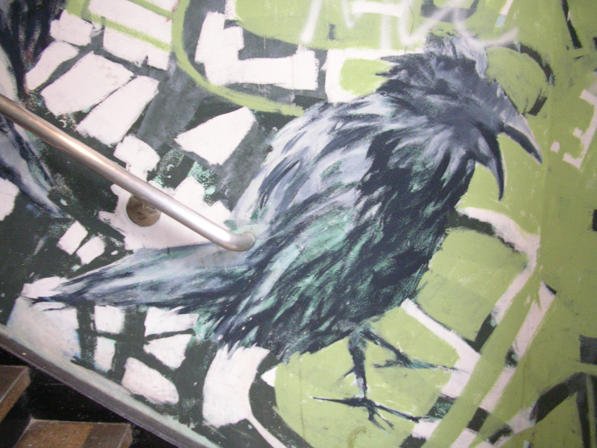
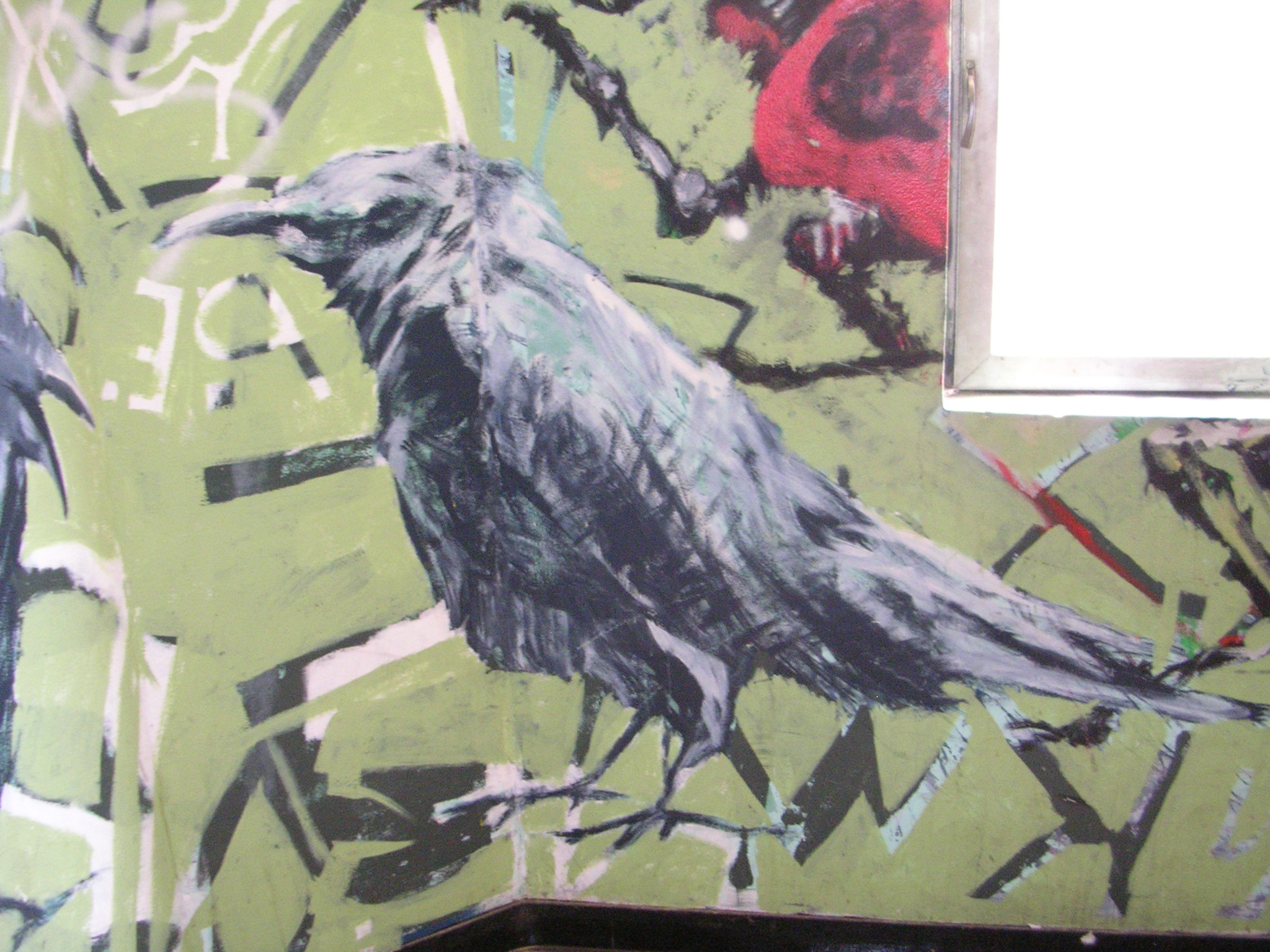
our logo was inspired by some wall art found at SJSU’s art building.  you don’t have to use our logo, in fact we would prefer something different.

Advertisement

Stone

A quick thumb and refined thumb. I’m planing on taking it further.

Stone

kidcrash – “snacks”

my favorite band in the world, the kidcrash, have posted a new track for their upcoming album “snacks“.  their artwork for their past album covers intrigue me.  i sketched this while listening to their track “wound eraser” and trying to encompass their past album art by just sketching rand-o stuff. but as you can see it will never have that “artsy” feel to it.  D:

wound_eraser_collage

kidcrash – “jokes” lp cover art

kidcrashlp_big

kidcrash – demo 2006

kidcrash_demo_2004

The Shrine Logo Development

Well I worked on the logo for the movie too. take a look at the process from start to finish. it was a pretty crazy battle!

Logo Concept A

Logo Concept A

Logo Concept B

Logo Concept B

Logo Concept C

Logo Concept C

After showing these concept, the direction wasn’t favored because they didn’t look “real” enough. We wanted something that looked like it was carved by hand on the Shrine itself! and National Geographic or someone took a picture of it. So I explored alot with hand made fonts that were inspired by Greek and Roman hand chiseled tablets. Here are some of the results!

Logo Concept 4

Logo Concept 4

Logo Concept 5

Logo Concept 5

The above concept we had the idea of the logo being carved into the wall of a cave and a torch was being used to light it. This was canned because the color palette was too warm and not dark and scary enough.

Logo Concept 6

Logo Concept 6

Played with mist/fog a common element in the film but it didn’t work too well. The next one is the final where the title is surrounded by latin text as if it was decoded for its meaning. The latin text plays a part in the film as the village where “The Shrine” speaks latin. The crack was placed to give it an ancient look and gives the feeling that something is going to go wrong. And we were excited by the cold color palette that looked like it was lit a night.

Final Logo Concept

Final Logo Concept

Well thats it guys. I know its not true sketching, but I did alot of thumbnails to get to these concepts. I’ll be back now with some regular good old fashioned sketching!

Mr. Fancy 2.0

Hey-O! Sooo remember the Mr. Fancy sketch….. Well here he is as a 3D model!!!

He is only 8700 triangles, meant to be a game character.

This is just the base model that i am still working on. Textures and color will come soon!

Mr.FancyrenderMr.Fancyrender2

Mr.Fancyrender3

scribbles

This is a technique I use to loosen up and try to break the monotony when designing. We tend to fall into drawing the same shapes etc. To break out of that I use a piece of scrap paper, a piece used for calisthenics is the best, and draw random scribbles. The scribbles will start to look like objects or have a certain dynamic that is appealing. From those scribbles, I usually pull out lines and shapes that give interesting proportions or objects. Doing this usually frees me up and at times I’m able to pull good stuff, but it doesn’t work all the time.

scribbles

Capt. Ahab (Mouse version!)

Thumbs:AhabThumbs

Thumbs Refined:AhabRefined

Final:Ahabnewfinal

Gate

Illustration: Uhh some sort of gate leading to empty land….

Gate

But can it walk?

This was done digitally when I still had my Intuos 2. Back when I was playing Starcraft I was inspired by the siege-tank and attempted to make a siege mech. I wasn’t too happy with it but it allowed me for great exploration. Back in the days of Mech Warrior my buddies would argue that mech were basically tanks with legs, and if the legs where taken out it would just be a turret depending how it landed. But I didn’t care. Mechs exist for good sci-fi stories and toys.

siege-mech

Octo-Girl

This was my final for my Anatomy class. Basically we were required to combine a human with an animal.

anatomyfinal-copy1