Mr. Fance 2.0 Textured


Link to the turnaround video:
http://www.coroflot.com/public/individual_file.asp?individual_id=191609&portfolio_id=2650896
Link to the turnaround video:
http://www.coroflot.com/public/individual_file.asp?individual_id=191609&portfolio_id=2650896
I could say I’ve been busy which is partly true after getting a second job but, for the most part I have been lazy. And, looking at the time I could be spending on doing more creative things, I end up chosing something unproductive and unrewarding. Then I go into a cycle of regret and loathing that I question myself if I even have the passion to create anymore or if I was just looking for that steady job to pay my filthy habits. There are many books that have been read partially or have been unread, many drawings and sketchings that haven’t been finished, and many ideas that haven’t seen the light of day on paper. Perhaps all creative people go through this cycle of aspiration and laziness.


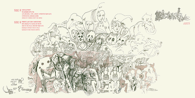
my favorite band in the world, the kidcrash, have posted a new track for their upcoming album “snacks“. their artwork for their past album covers intrigue me. i sketched this while listening to their track “wound eraser” and trying to encompass their past album art by just sketching rand-o stuff. but as you can see it will never have that “artsy” feel to it. D:

kidcrash – “jokes” lp cover art
kidcrash – demo 2006

Well I worked on the logo for the movie too. take a look at the process from start to finish. it was a pretty crazy battle!

Logo Concept A

Logo Concept B

Logo Concept C
After showing these concept, the direction wasn’t favored because they didn’t look “real” enough. We wanted something that looked like it was carved by hand on the Shrine itself! and National Geographic or someone took a picture of it. So I explored alot with hand made fonts that were inspired by Greek and Roman hand chiseled tablets. Here are some of the results!

Logo Concept 4

Logo Concept 5
The above concept we had the idea of the logo being carved into the wall of a cave and a torch was being used to light it. This was canned because the color palette was too warm and not dark and scary enough.

Logo Concept 6
Played with mist/fog a common element in the film but it didn’t work too well. The next one is the final where the title is surrounded by latin text as if it was decoded for its meaning. The latin text plays a part in the film as the village where “The Shrine” speaks latin. The crack was placed to give it an ancient look and gives the feeling that something is going to go wrong. And we were excited by the cold color palette that looked like it was lit a night.

Final Logo Concept
Well thats it guys. I know its not true sketching, but I did alot of thumbnails to get to these concepts. I’ll be back now with some regular good old fashioned sketching!
Hey-O! Sooo remember the Mr. Fancy sketch….. Well here he is as a 3D model!!!
He is only 8700 triangles, meant to be a game character.
This is just the base model that i am still working on. Textures and color will come soon!


This is a technique I use to loosen up and try to break the monotony when designing. We tend to fall into drawing the same shapes etc. To break out of that I use a piece of scrap paper, a piece used for calisthenics is the best, and draw random scribbles. The scribbles will start to look like objects or have a certain dynamic that is appealing. From those scribbles, I usually pull out lines and shapes that give interesting proportions or objects. Doing this usually frees me up and at times I’m able to pull good stuff, but it doesn’t work all the time.

great movie. would recommend sitting farther back for this one if you get motion sickness.
fyi, i love drawing armoury-type stuff. drew this iconic scene using a papermate pro fit pen on 98 HP printer paper. added some photshop color to give the sketch more pop.

this is a shotgun blast of some ideation sketches i did for the fore-mentioned creature project jon has showcased. i came up with a creature that you wore on your neck that would eat second-hand smoke in your environment. this was a great warm up project that lasted about two weeks.

Hey! its been along time since i have posted anything! sketched this guy up yesterday! 
Just recieved my copy of “Seductive Espionage: The World of Yuki 7” (http://www.fleetstreetscandal.com/store.php?itemid=123), and it is gorgeous…its been featured on NotCot and is a must have…Kevin Dart also created an awesome fake movie trailer (http://www.artofthetitle.com/2009/07/13/a-kiss-from-tokyo/) that coincided with the book and posters, and i hope they make a full length feature! as always every time a get a book i get excited and start drawing from it…i love the characters, the whole 60’s spy theme and his style…thanks for the extra dose of inspiration Mr. Dart!


The soundtrack for the Lineweights REVOLUTION has come!
http://streetsweepersocialclub.com/
Our boy Tom Morello has teamed up with MC/Activist/Artist/Front man of The Coup…Boots Riley. Morello representing the SoCal, Boots from the mean streets of Oakland representing NorCal…join together to spread the word of uprising, change and revolution. Street Sweeper Social Club is….”more than a band, it’s a social club.” Love the idea of looking at MUSIC as more than the “individual band”, but more about the SOCIAL group it creates. Thats the same reason why Lineweights is online! Enjoy the boombox-tommy gun-earshot!


I wasn’t lucky enough to have taken the same class that Jon, Alex, Dan and Cres took when they sketched out those dope “creature sketches” that Jon just posted. I was fortunate enough to have the very same teacher throughout SJSU ID; Prof. John McClusky. The connection that many of us had with him, was something that fueled the fire to strive beyond the norm. Good, well informed design was only one of the many passions we picked up from John….Movies, Concept/Entertainment Design, Concept Artist, Sci-Fi, Infinite Futures and much more. This sketch would be very ….Seussian…in one of Johns great qrit’s! Thanks so much for the many inspirations John!
I sketched this around the same time JC sketched this creatures…guess it was one of our many late night sketch jam sessions! Dude, how about that for our Lineweights “events”…Sketch Jam, Sketch Jam…
Dr. Seuss has always been one of my favorites and very influential as a young kid trying to learn to draw…Thanks Theodor Seuss Giesel!
Enjoy!


![3628692459_fb755191a7[1]](https://live.staticflickr.com/2581/3682050553_72c5080af1_s.jpg "3628692459_fb755191a7[1]")
![3628695853_a1e6a40195[1]](https://live.staticflickr.com/3568/3682863860_b7c69e3aea_s.jpg "3628695853_a1e6a40195[1]")
![3629536468_4c1c67e0c2[1]](https://live.staticflickr.com/2470/3682050349_88c7a10598_s.jpg "3629536468_4c1c67e0c2[1]")
